
Identity project for Pluto Rise.
Talented Musician ‘Pluto Rise’ approached me with a brief to design an understated identity that would convey a sense of simplicity and modesty, without compromising its impact and prescence. it was outlined from an early stage that pluto rise wanted a typographic logo that incorporated the entire ‘pluto rise’ name in lower case, which could also translate to a smaller logo that would carry the identity by itself.
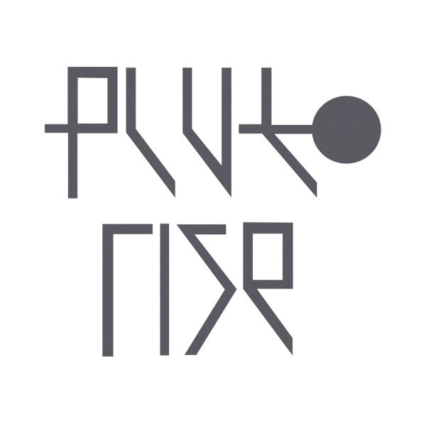
the slim, geometric, clinical letterforms carry a sense of modesty, discarding the superfluous or fussy. they also convey a feeling of sci-fi and the cosmos, a decision taken to connote the name of pluto rise and keep the overall theme of space and planets consistent throughout the entire identity.
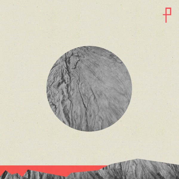
i was also asked to create album artwork that again, stayed true to the brief. as you will notice on this concept piece, the ‘p’ from the typeface is working alone to carry the identity of the artist.
yrcx mini cup disposable vape 7000 puffs iced water
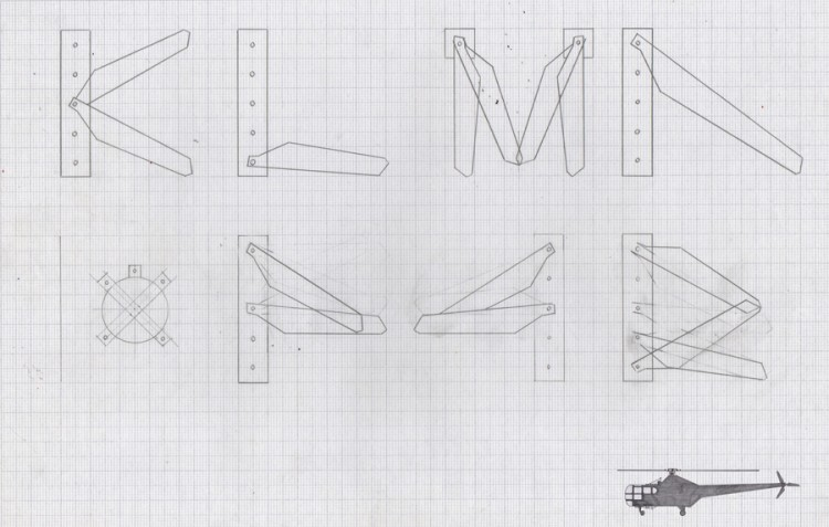
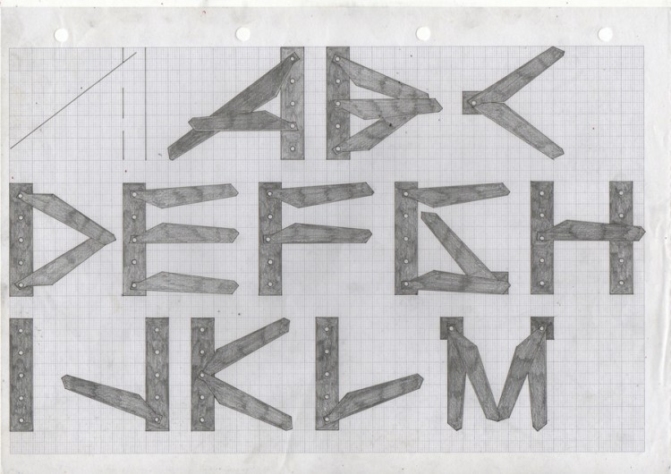
the ‘propeller’ typeface was developed with a meticulous process, utilising only five components, two of which act as pivot points, that the propeller blades swivel on in order to create the letterforms. the very nature of this system caused varying widths and other characteristics to occur, which provided interesting results. click through the images and you’ll get a better idea of whats going on here…
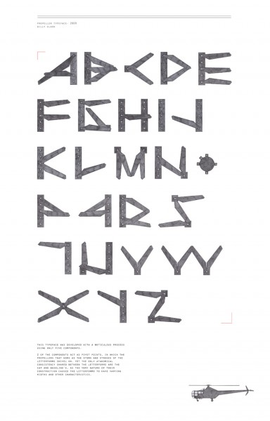
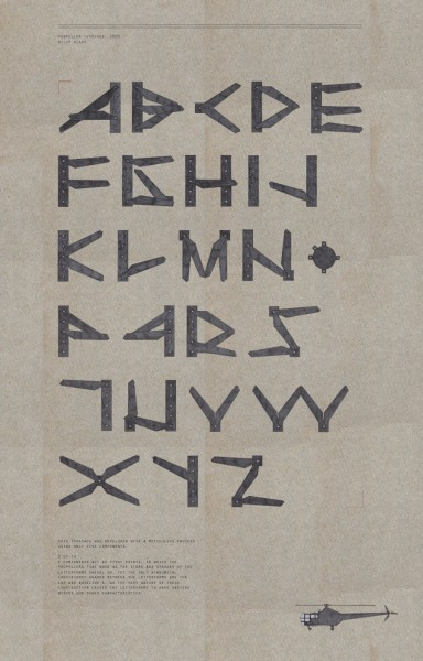
constructing the letterforms
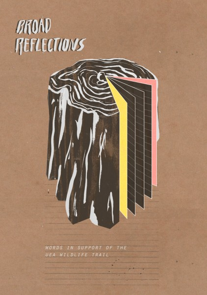
Book cover commissioned by writer Alex Allen for the UEA publication ‘Broad Reflections- words in support of the UEA wildlife trail.’