Identity project for Pluto Rise.
Talented Musician ‘Pluto Rise’ approached me with a brief to design an understated identity that would convey a sense of simplicity and modesty, without compromising its impact and prescence. it was outlined from an early stage that pluto rise wanted a typographic logo that incorporated the entire ‘pluto rise’ name in lower case, which could also translate to a smaller logo that would carry the identity by itself.
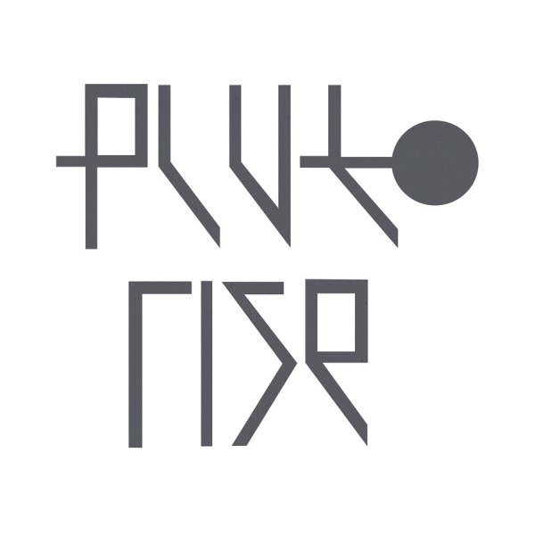
the slim, geometric, clinical letterforms carry a sense of modesty, discarding the superfluous or fussy. they also convey a feeling of sci-fi and the cosmos, a decision taken to connote the name of pluto rise and keep the overall theme of space and planets consistent throughout the entire identity.

i was also asked to create album artwork that again, stayed true to the brief. as you will notice on this concept piece, the ‘p’ from the typeface is working alone to carry the identity of the artist.


christmas card design 2011
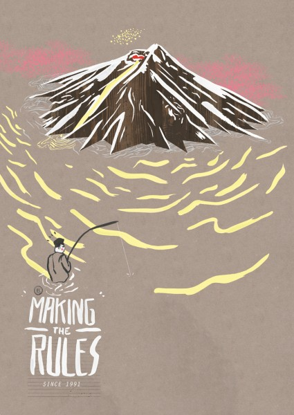
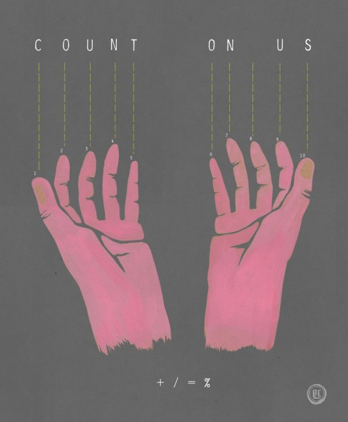
Design entry to the EVISU ‘make the rules’ poster competition hosted by Don’t Panic. The entry qualified to be exhibited at the EVISU 20th anniversary exhibition held at the ideas generation gallery in East London. Look out for it at 1:32.
BNTL – Evisu 20th Anniversary Make The Rules from BNTL on Vimeo.
